Overview
My Role
UX Designer UI Designer Graphic Designer
Designed For
Client project for UMSI Marketing and Comms done through SI 616 - Adv. Graphic Design
Team
Mohammed Tajalli - UX/UI & Graphic Designer
Timeline
December 4th 2024 — December 13th 2024
01 INTRODUCTION
The University of Michigan School of Information (UMSI) website serves as a gateway for prospective students to explore programs, faculty, and research. However, its previous design lacked emotional engagement and intuitive navigation. Our team reimagined the website to evoke joy, curiosity, and a sense of belonging through bold visuals, interactive elements, and a user-centered approach.
Through discussions with UMSI’s Marketing and Communications Manager, we identified key objectives:
Promote faculty & research: Showcase groundbreaking work and thought leadership.
Improve navigation: Ensure the site is intuitive for prospective students.
Support recruitment efforts: Highlight what it’s really like to study at UMSI.
Differentiate UMSI: Clearly define what sets it apart from other iSchools.
Emphasize development: Communicate the school’s growth and future impact.
Our main focus was solving the site's visual design and architecture problems while ensuring that the content aligned with UMSI’s strategic vision.
02 MARKET RESEARCH
Site Analysis
Competitive Analysis
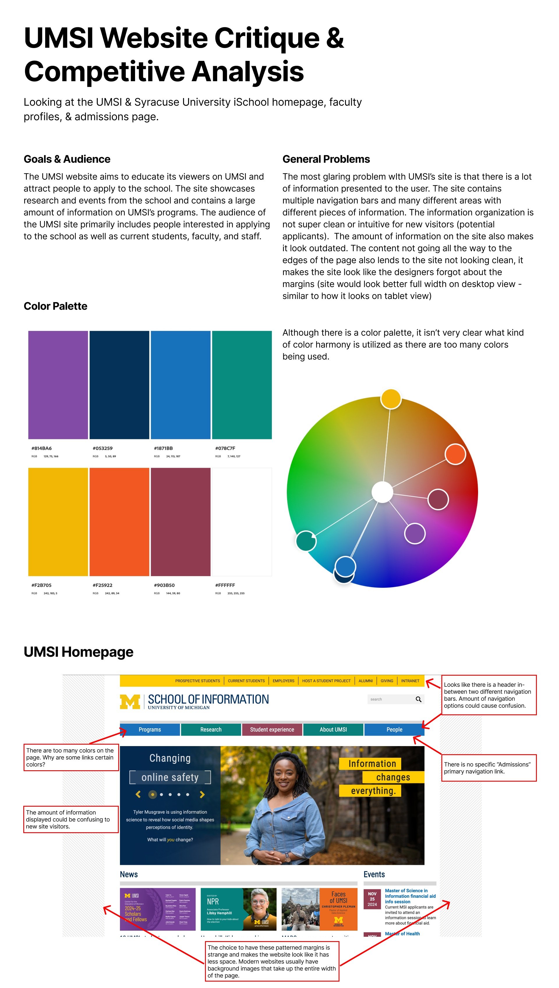
We analyzed the UMSI site and conducted a competitive analysis. Our analysis revealed major usability issues—cluttered navigation, overwhelming information density, and a lack of emotional engagement—making it difficult for users to explore UMSI’s unique offerings.
Our site analysis highlighted additional challenges:
Information Overload: The UMSI site had multiple navigation bars, dense text, and too many links, making it hard for users to find key information.
Outdated Design: The lack of visual variety and excessive whitespace made the site feel outdated.
Weak Calls-to-Action: The admissions page lacked a strong “Apply Now” CTA, which is critical for recruitment.
Poor Differentiation: Compared to competitors like Syracuse University iSchool, UMSI’s site lacked a clear brand identity and storytelling approach.
We analyzed the UMSI website alongside Syracuse University’s iSchool to compare usability, engagement, and brand presence. Key takeaways:
Syracuse’s website had a cleaner, more modern look, with better spacing, dynamic visuals, and engaging content layouts.
UMSI’s admissions page was too long, text-heavy, and repetitive, overwhelming users instead of guiding them.
Faculty pages lacked engagement, with plain white backgrounds and minimal visual hierarchy.
Syracuse used strong CTAs and clear navigation, making it easy for users to take action.


